Our logo is the primary frame of reference for the brand and is often the first touchpoint consumers will experience. It is very important to use the logo consistently so we can continue to build brand equity over time.
Logos
Colors
Warm, uplifting, and authentic. The brand colors for the Disc Replacement Center of Saint Louis are used to visually enhance the brand story. The vibrant and dynamic shade of our signature color, Sunrise Orange, reflects our brand personality and is one of the most critical components of our visual identity.
Sunrise Orange
#ff7427
Night Sky
#333333
White
#FFFFFF
Typography
Anton
A B C D E F G H I J K L M N O P Q R S T U V W X Y Z
a b c d e f g h i j k l m n o p q r s t u v w x y z
Dosis
A B C D E F G H I J K L M N O P Q R S T U V W X Y Z
a b c d e f g h i j k l m n o p q r s t u v w x y z
Lato
A B C D E F G H I J K L M N O P Q R S T U V W X Y Z
a b c d e f g h i j k l m n o p q r s t u v w x y z
Photography
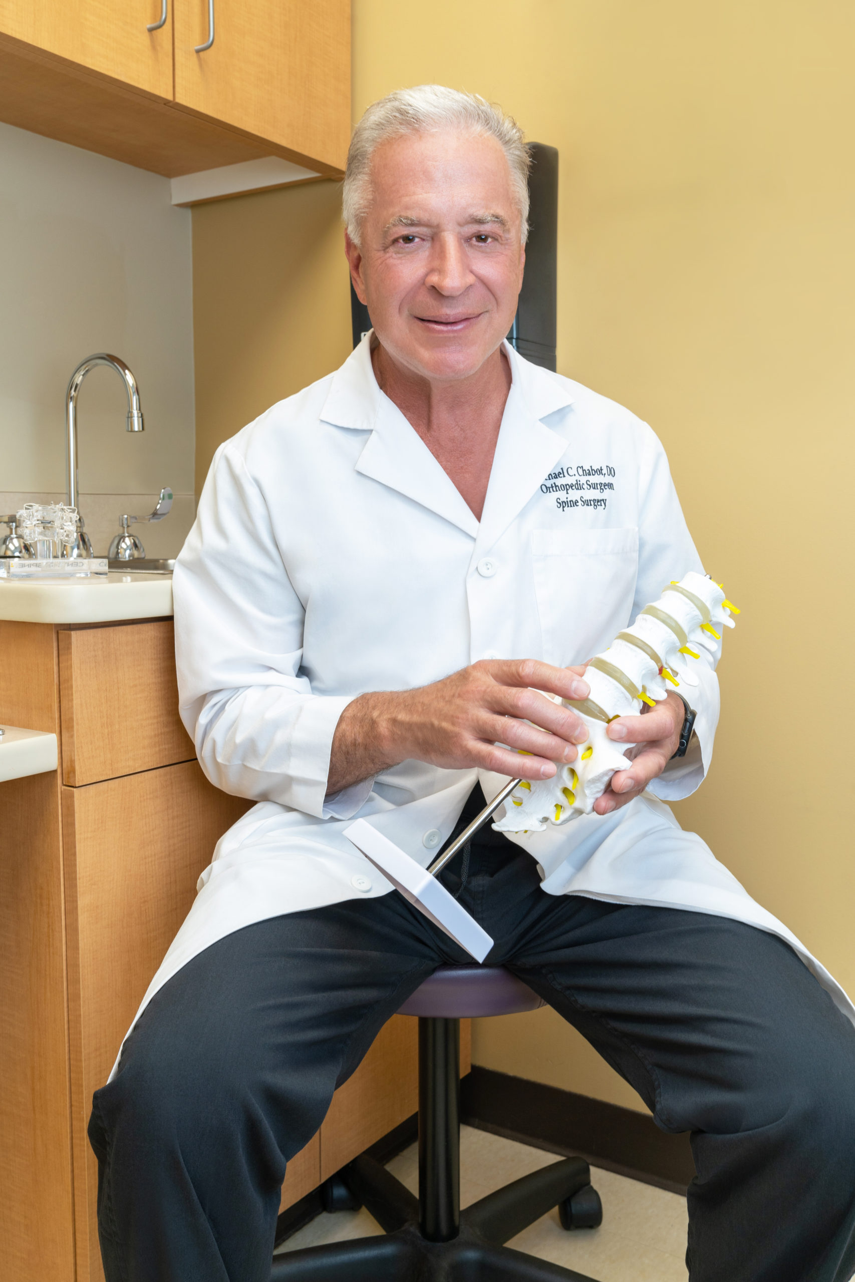
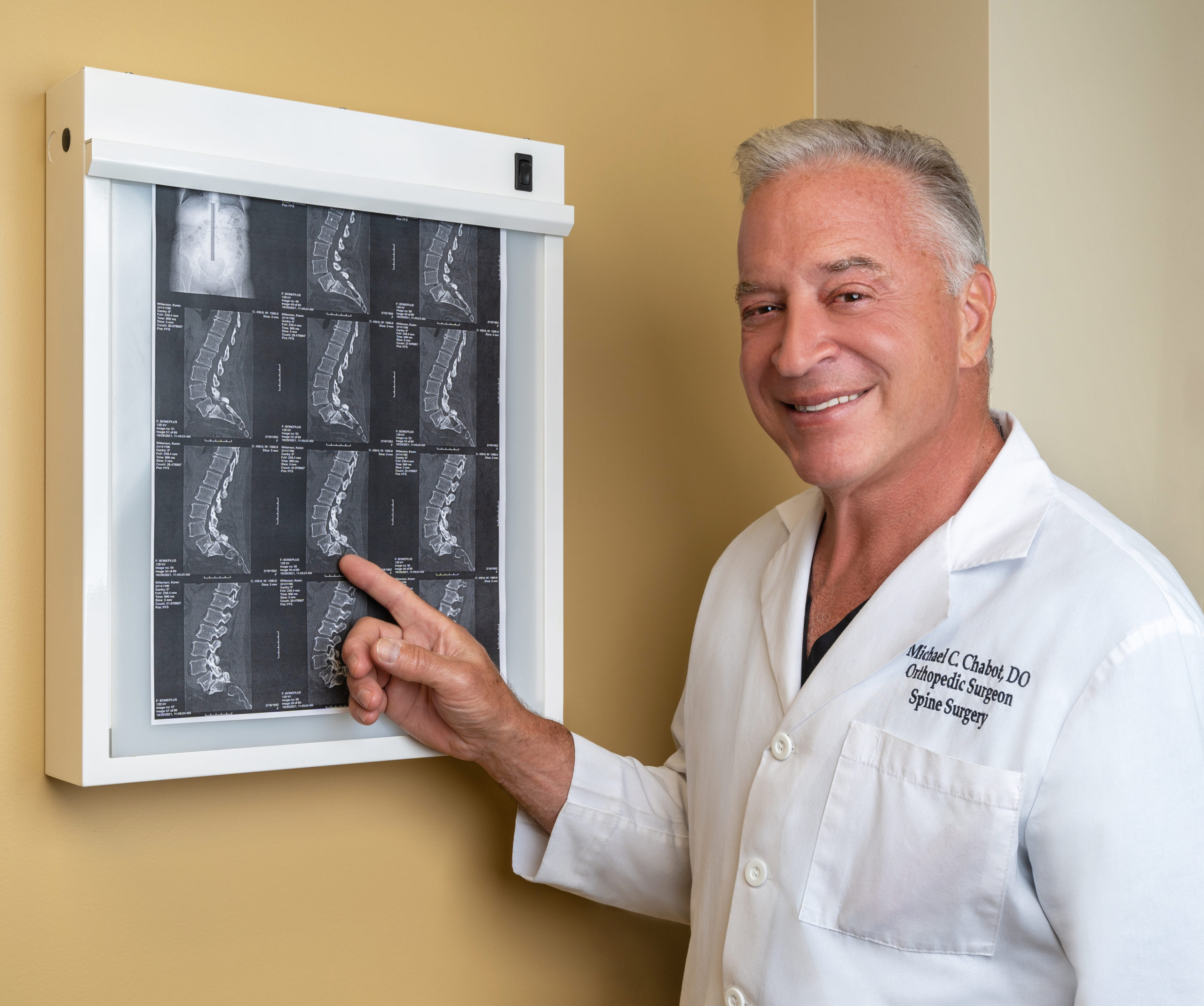
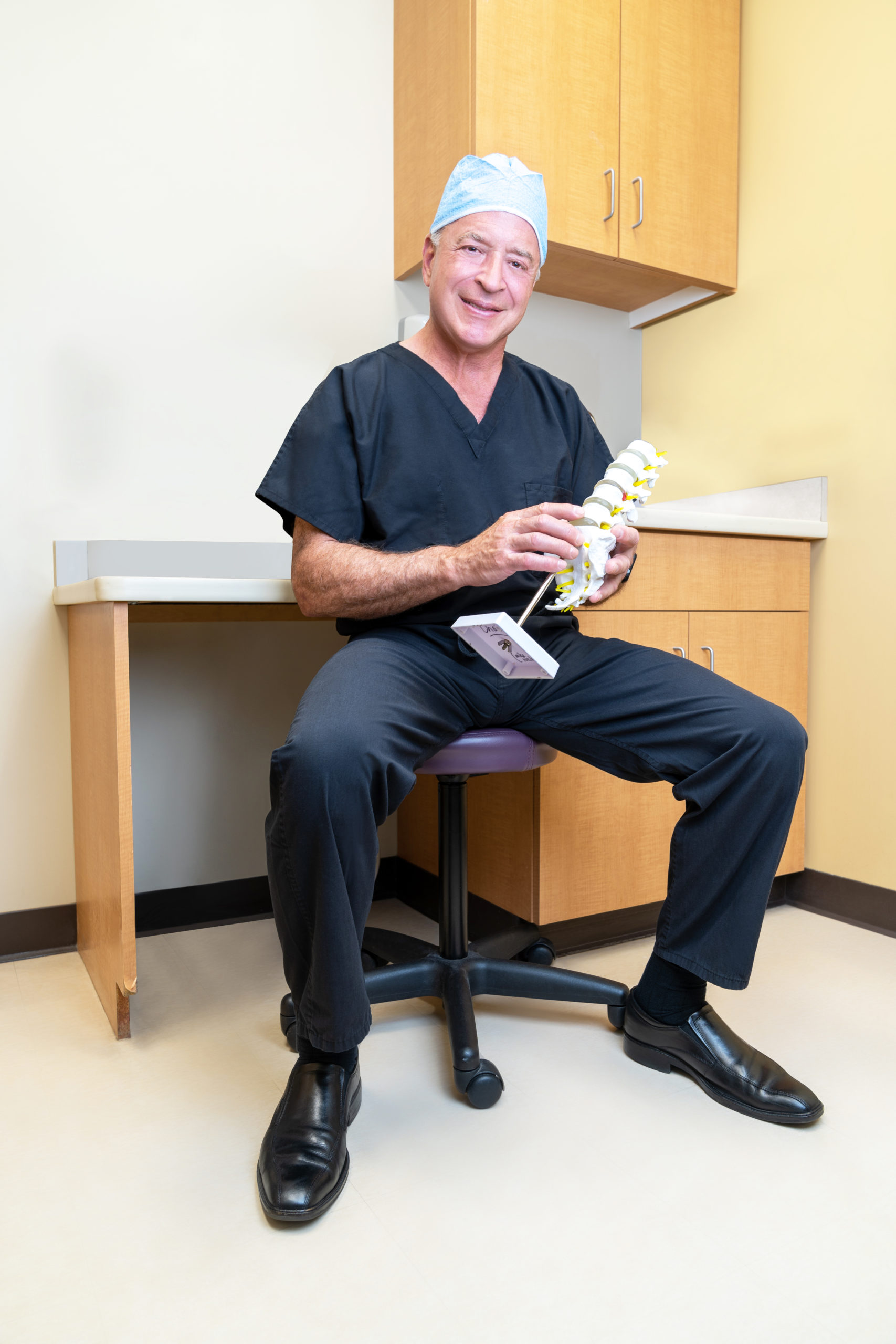
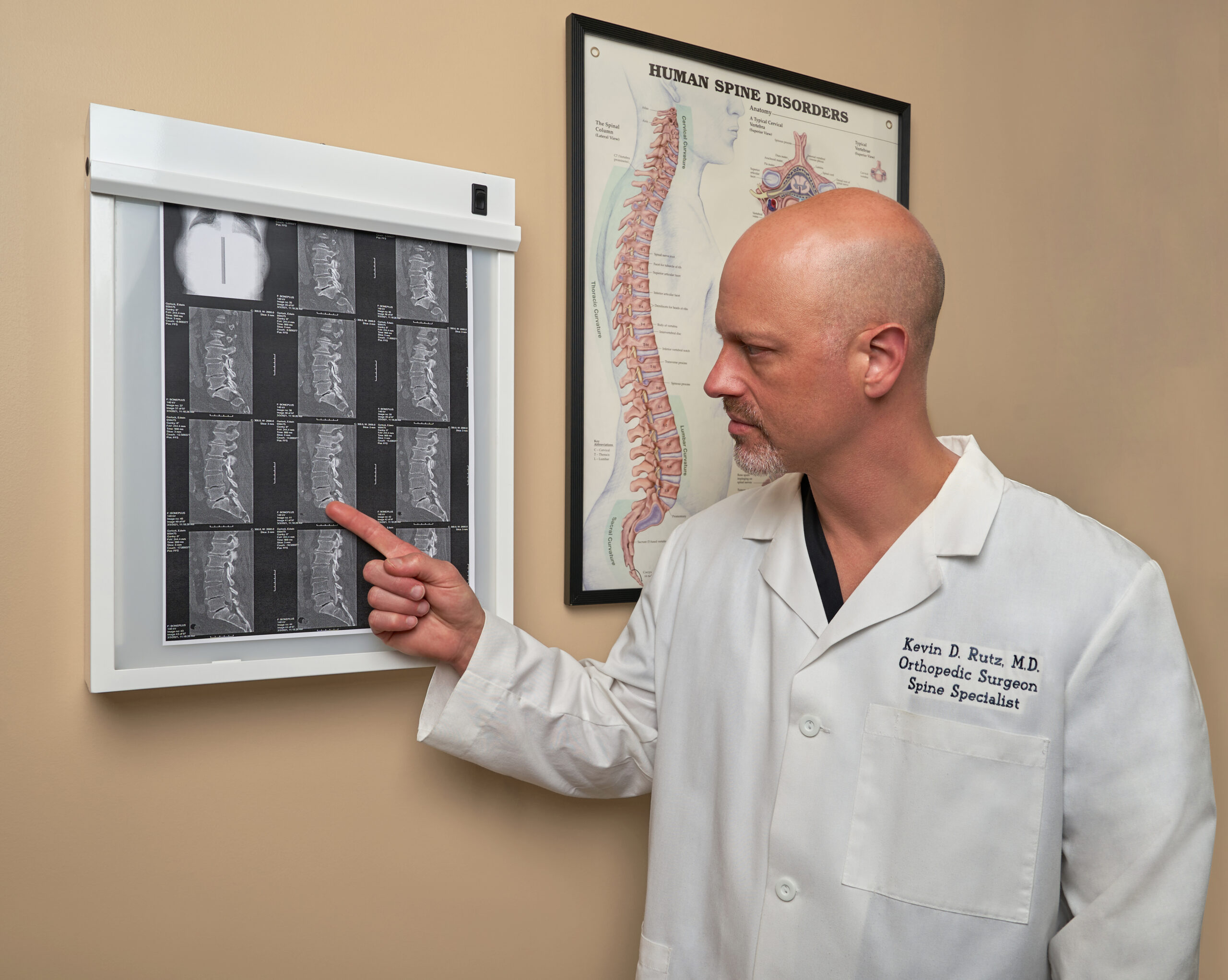
Our photography captures moments of positive connection between our patients and their active lifestyles. These images tell compelling, believable stories that draw audiences in and make them want to know more. Lifestyle imagery features feel-good moments that represent our patients in a realistic, but inspirational light and enable audiences to see themselves in each of them.


Kevin Rutz, MD


Michael Chabot, DO